





UsMeCa 2026 Typeface
Developed by Nacione™ Branding
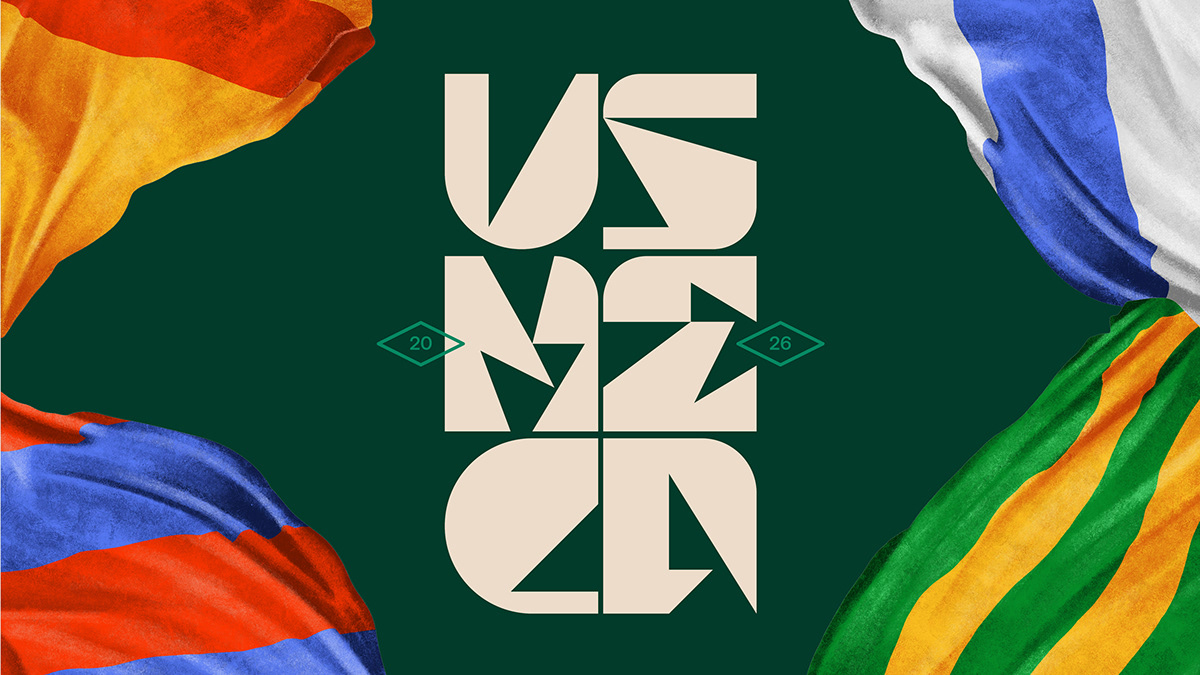
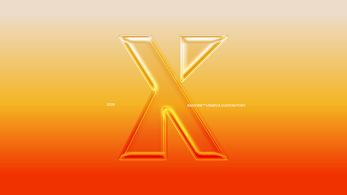
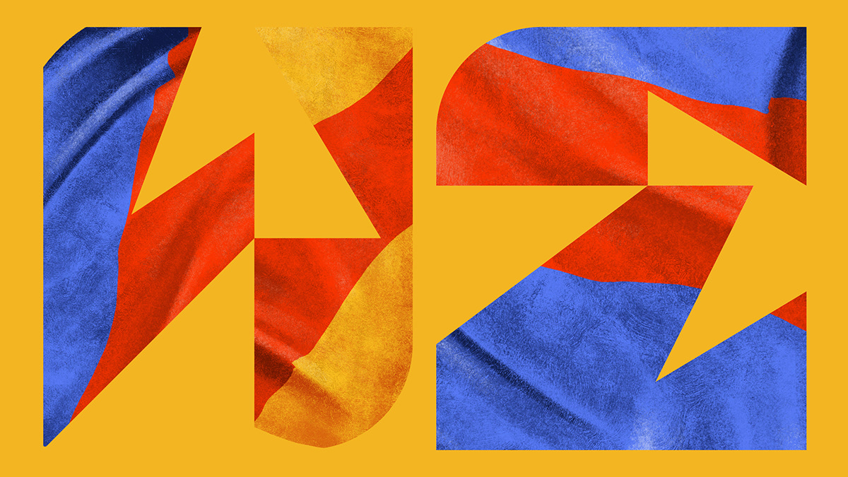
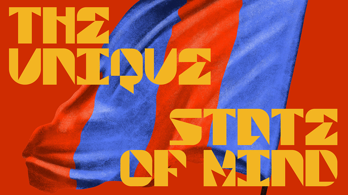
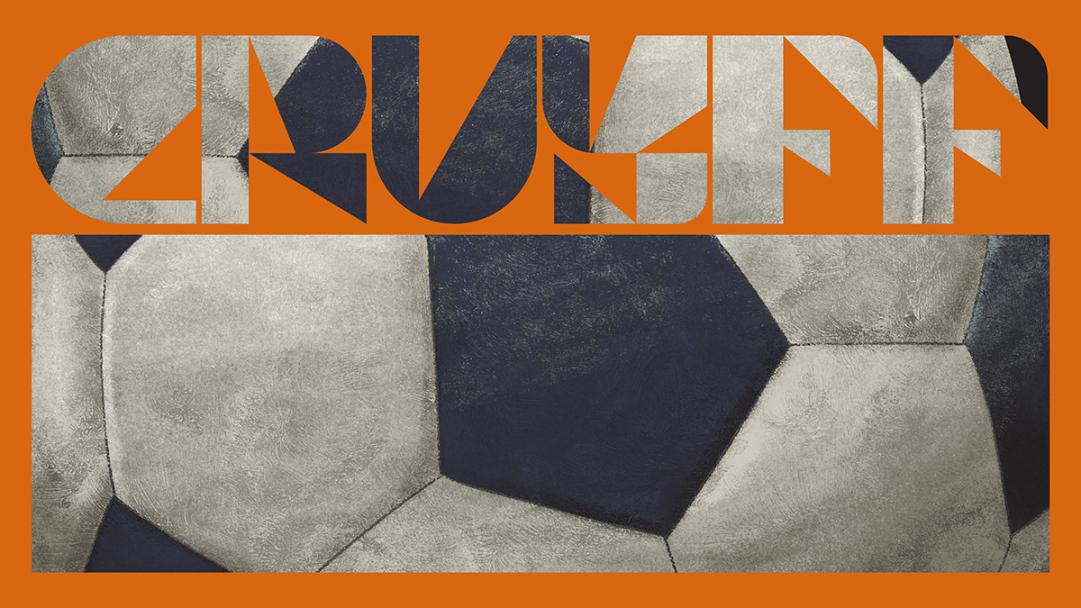
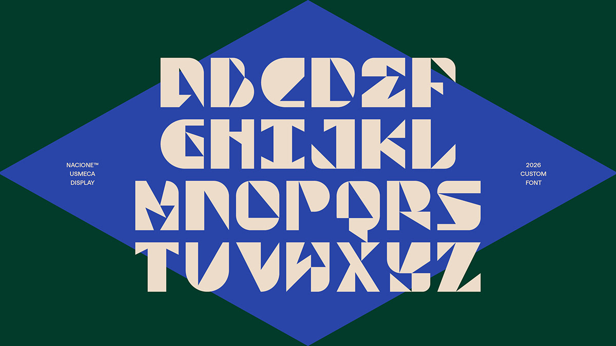
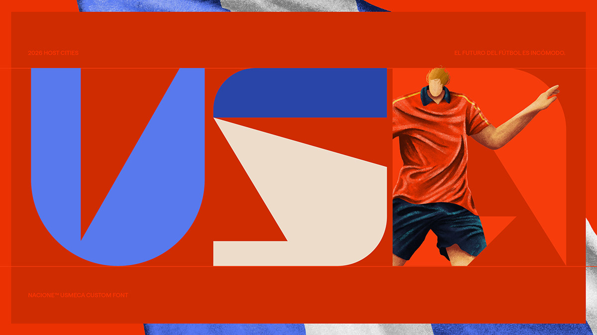
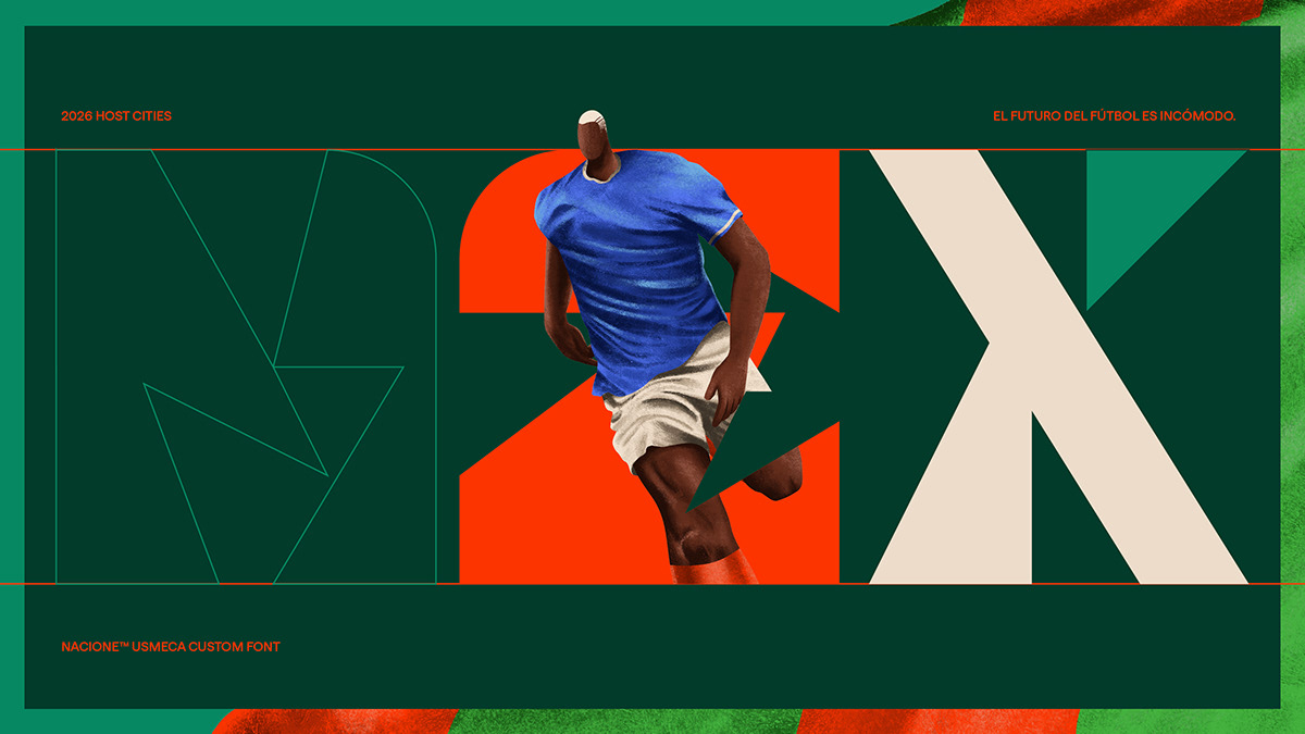
UsMeCa typography is a commemorative work made in honor of the World Cup in 2026, and follows a sequence of projects that are developed in years of competition by Nacione™.
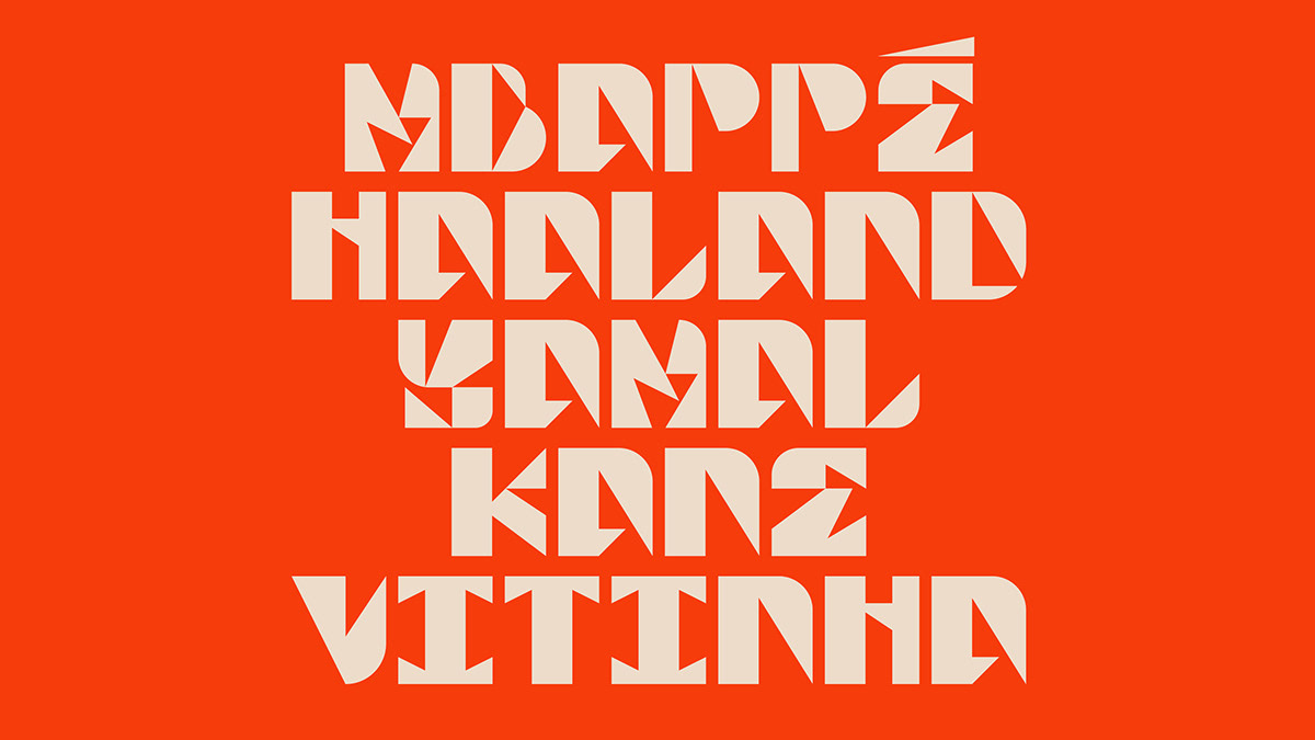
For this project, legibility is not a requirement. It is an opportunity to be bold and explore ideas that reflect the spirit of the times—a chance to break free from the constraints often imposed by commercial projects and create something purely for the sake of experimentation, without concern for utility. It exists at the boundary between art and design.
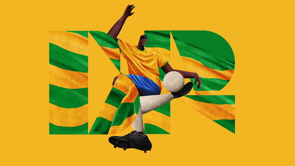
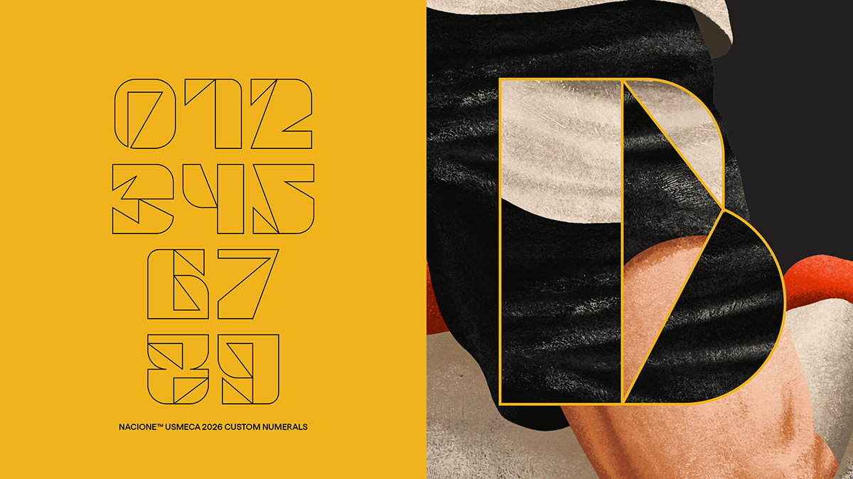
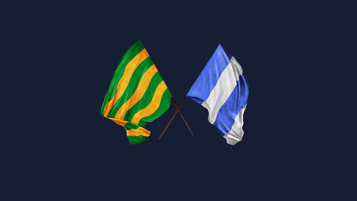
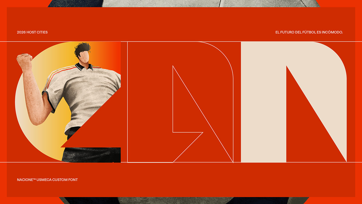
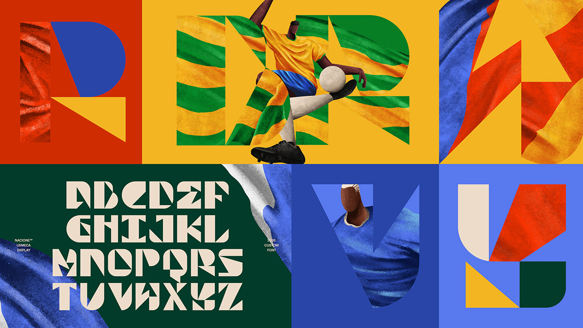
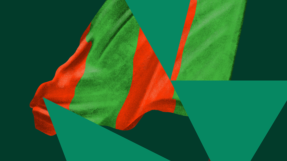
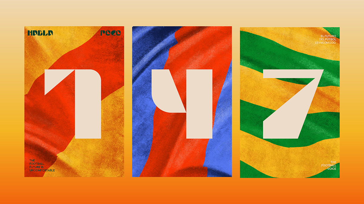
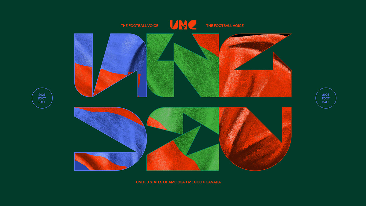
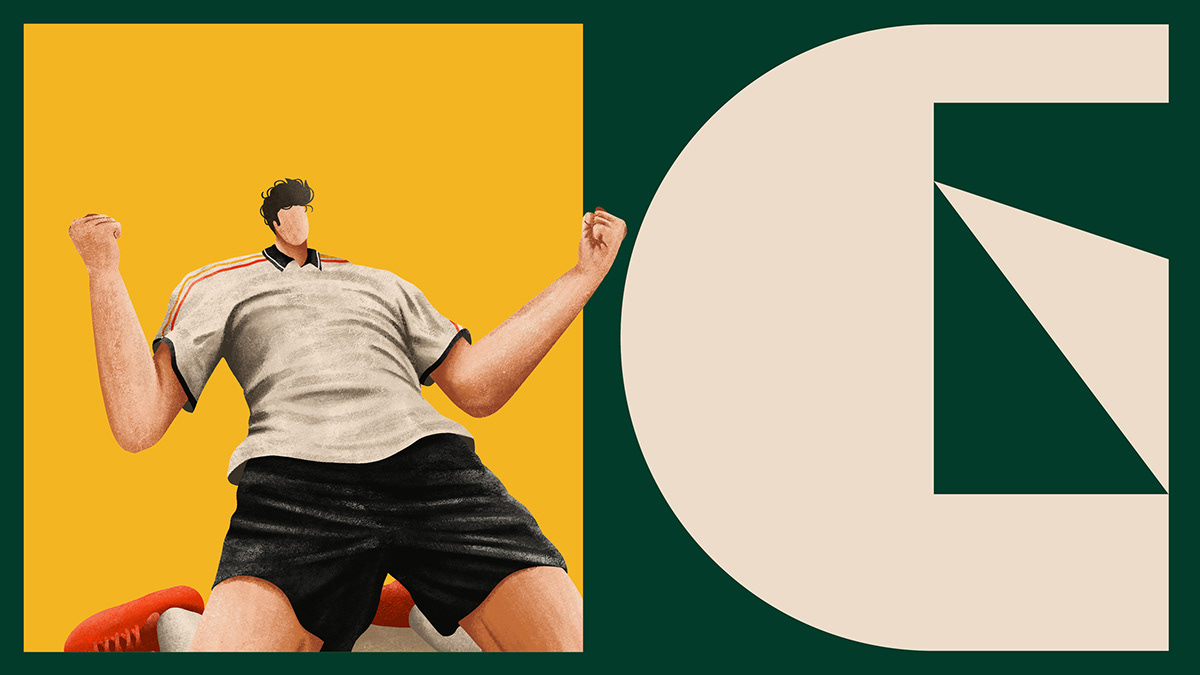
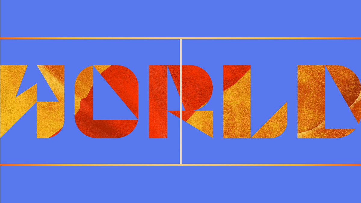
The flags and athletes depicted in illustrations by Gabriel Diogo—invited for his distinctive style, which celebrates both the sport and the everyday reality of South American football—form textures that layer with the typography. Together, they create vibrant visual compositions that capture the emotion and speed of a game that constantly evolves yet never loses its allure.
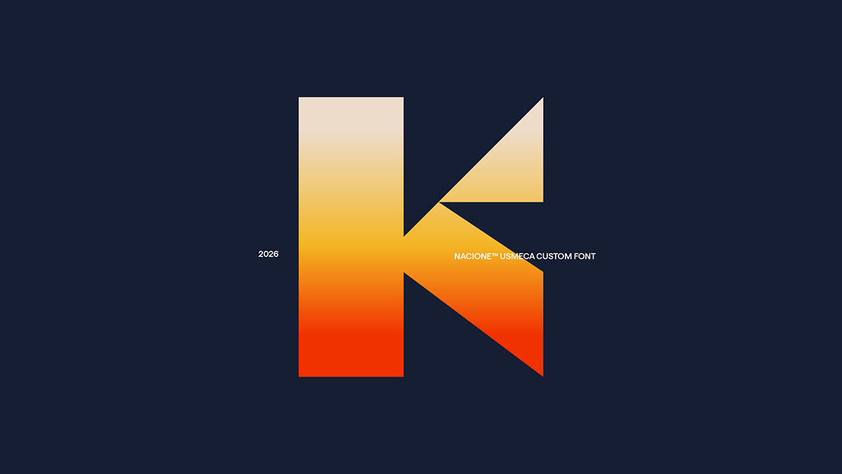
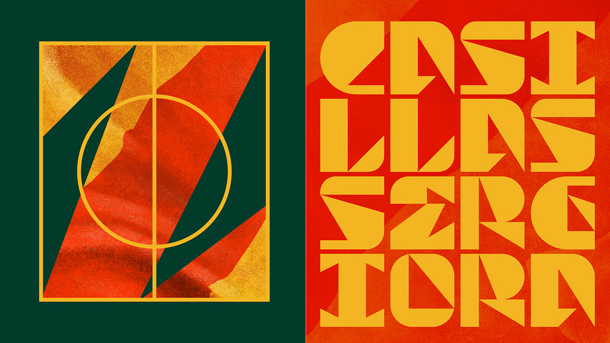
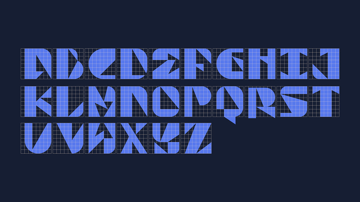
The concept behind the UsMeCa typeface was inspired by modern football: tactical, rigid, and structured in blocks, where players rarely stray from their assigned roles. We missed the unexpected moves, the dribbles, and the rebellious urge to defy the coach's instructions.
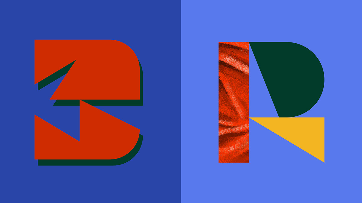
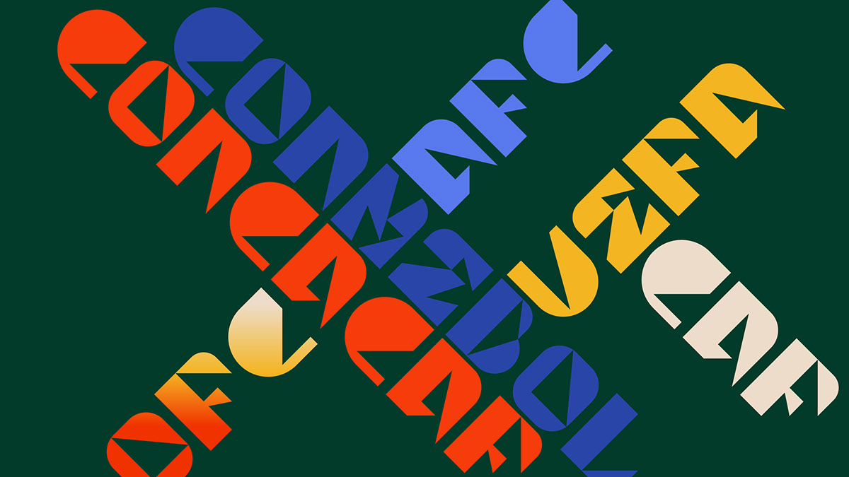
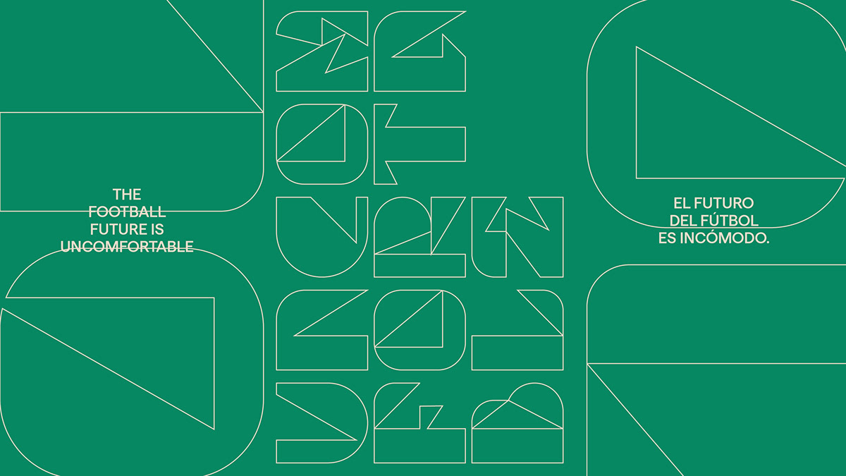
Working within a strictly constrained grid, we created a limited set of "plays." With few curves and a restricted visual vocabulary, we had to clearly distinguish letters from numbers, resulting in a bold display typeface. Right angles create colorful, modular compositions that challenge the very nature of writing.
The future of football is unsettling: standardized and structured. Yet it still leaves room for bold creativity.
The future of football is unsettling: standardized and structured. Yet, it still leaves room for bold creativity.
Illustrations by Gabriel Diogo
General Enquiries, Media & PR
NY +1 917 720 3422
UK +44 20 8144 3396
BR +55 11 984550190
Av. Presidente Juscelino Kubitschek, 1455 - 4º andar.
São Paulo, SP
04543 011

let's celebrate life
©2024, MapzFlaggen™ Capital Partners. All rights reserved. The content featured on this page is the responsibility of the authors and does not represent the interests of third parties. Images are only to promote discussion and illustrate concepts and ideas. MapzFlaggen™, Nacione™ and Lanatta™ are a trademark of Mapz-Flaggen Capital Partners.
This site uses cookies to make sure you have a true and respectful experience. Learn more about our Privacy Policy here.

