
Croatian Football Federation (Hrvatski Nogometni Savez)
Back in 2019, we took part in the competition to select a new brand identity for the Croatian national team.
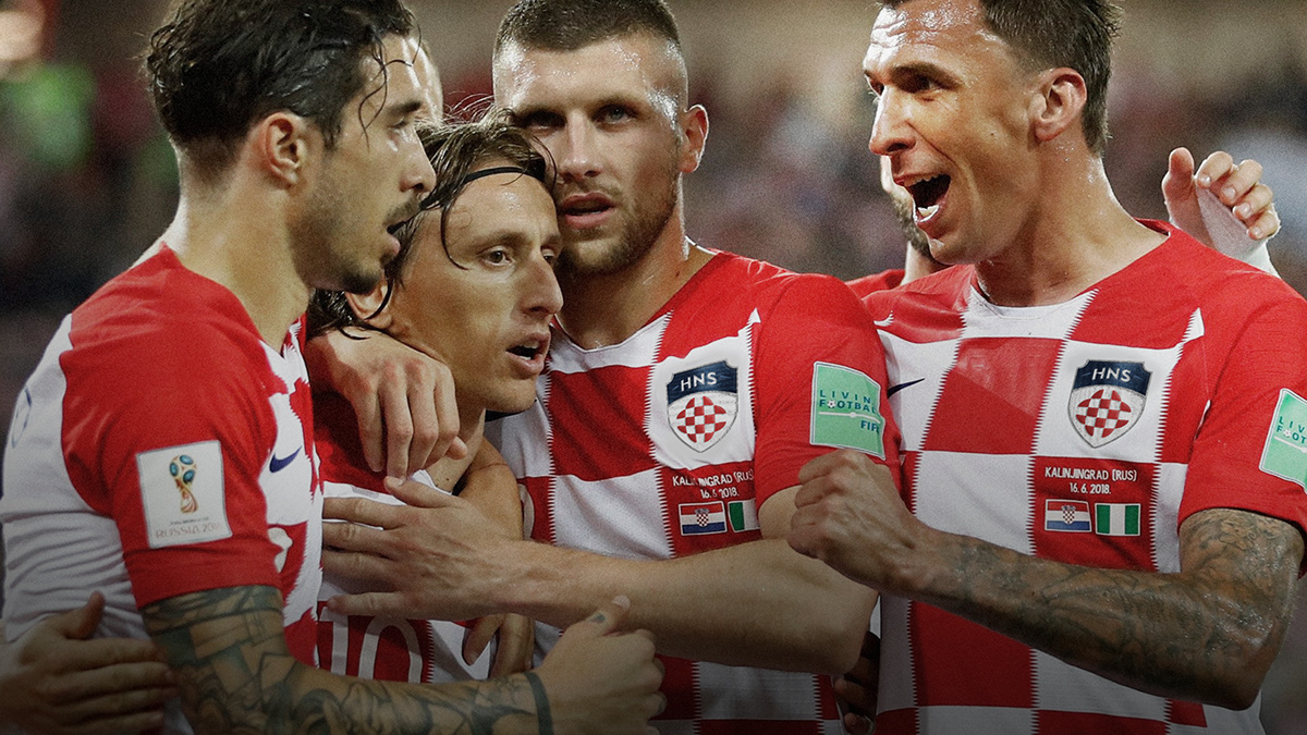
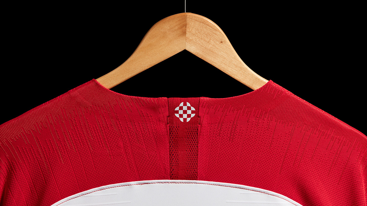
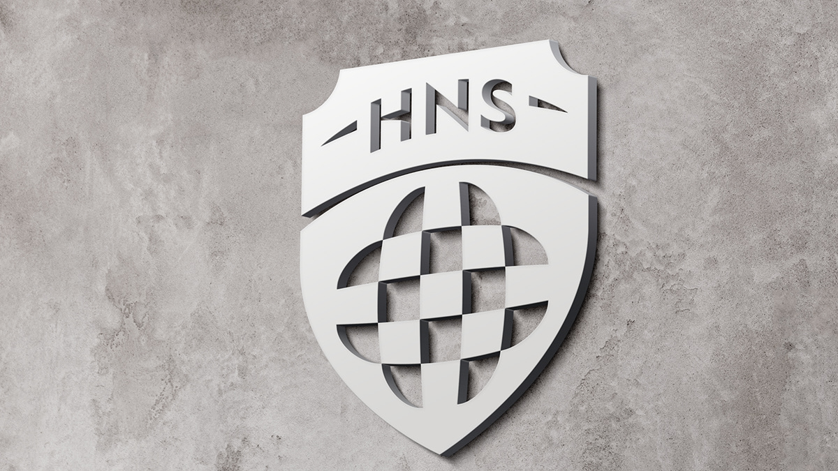
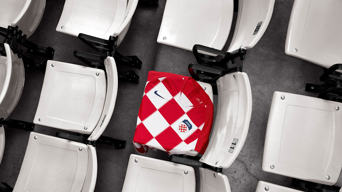
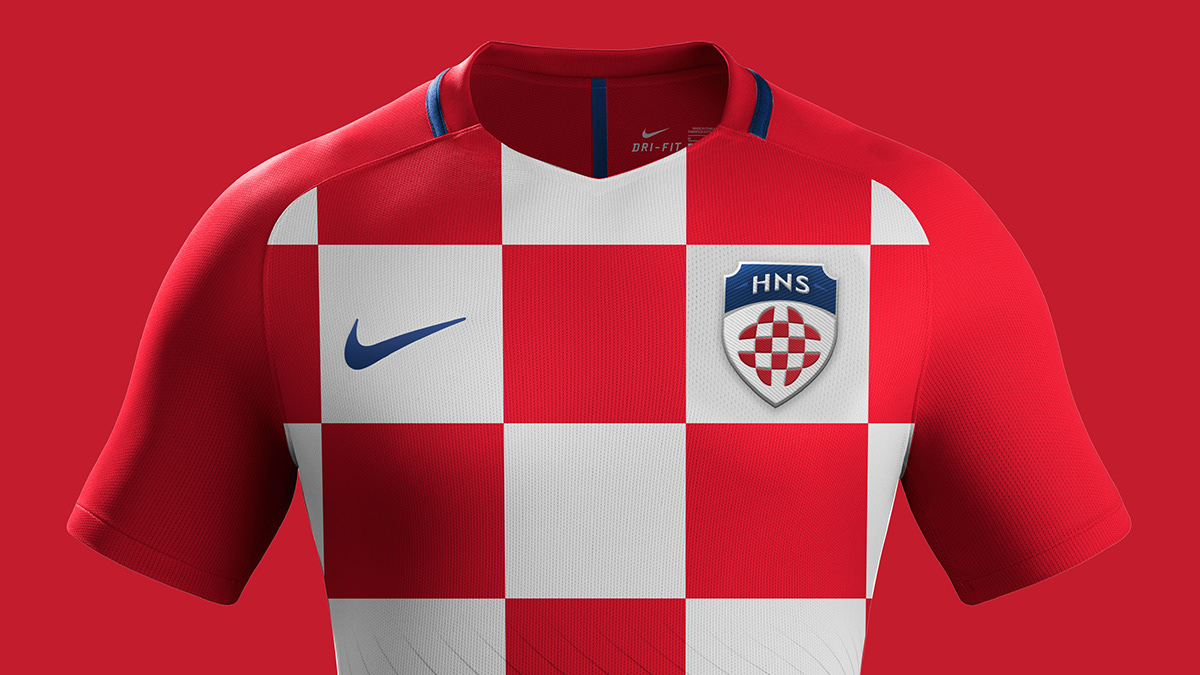
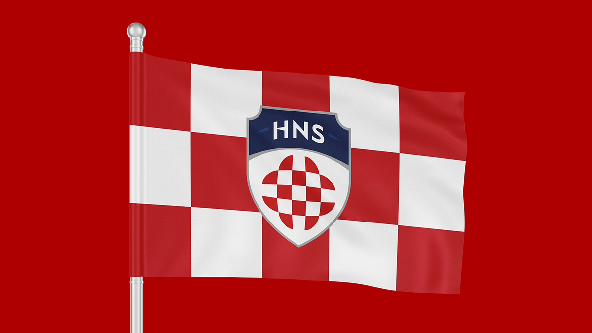
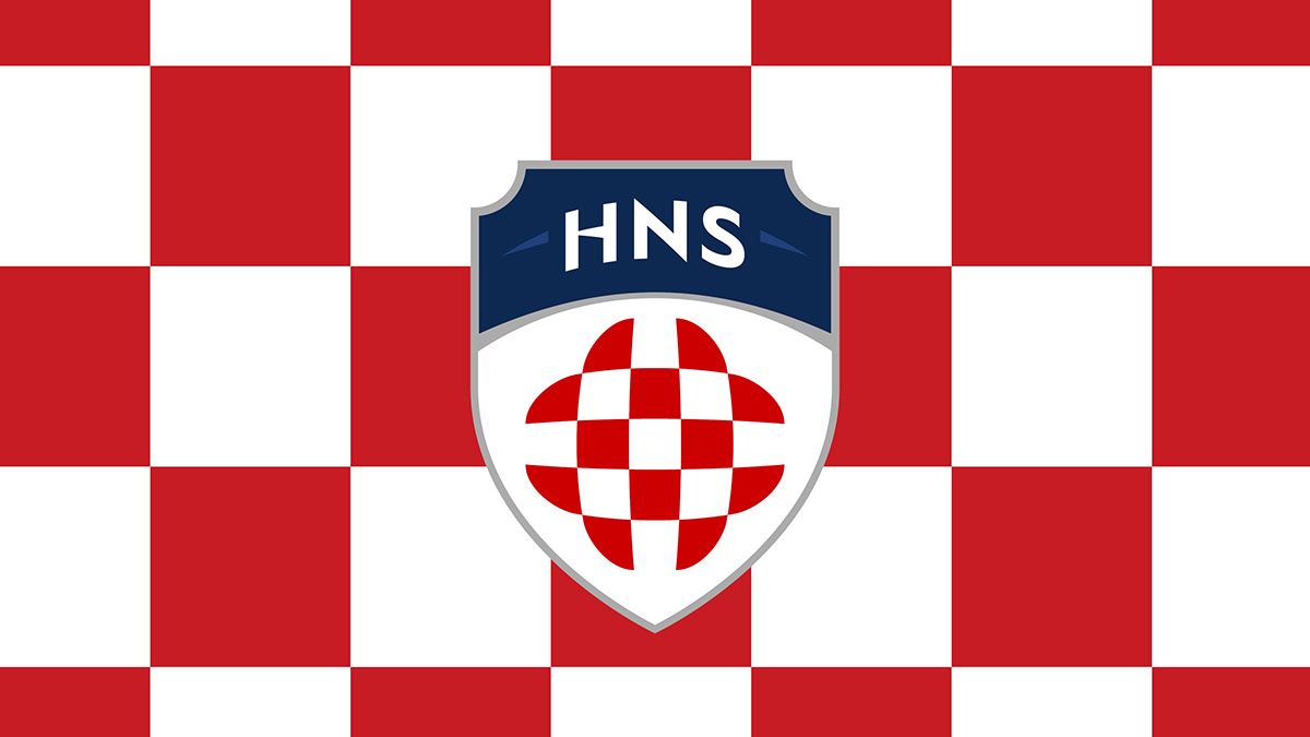
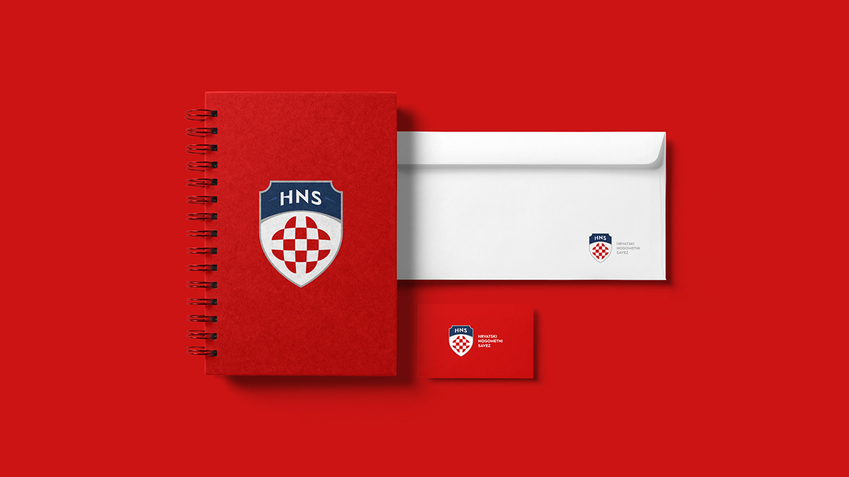
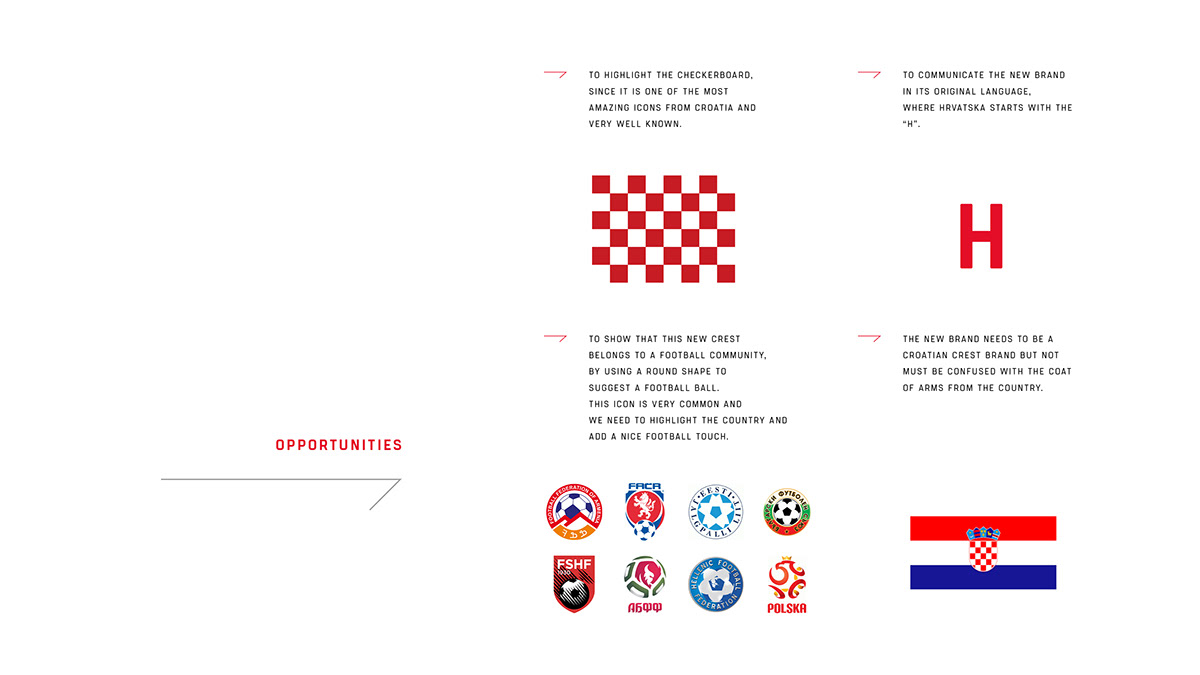
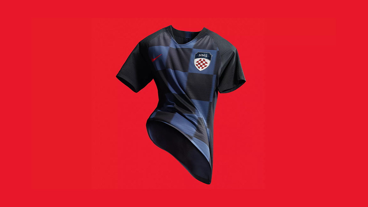
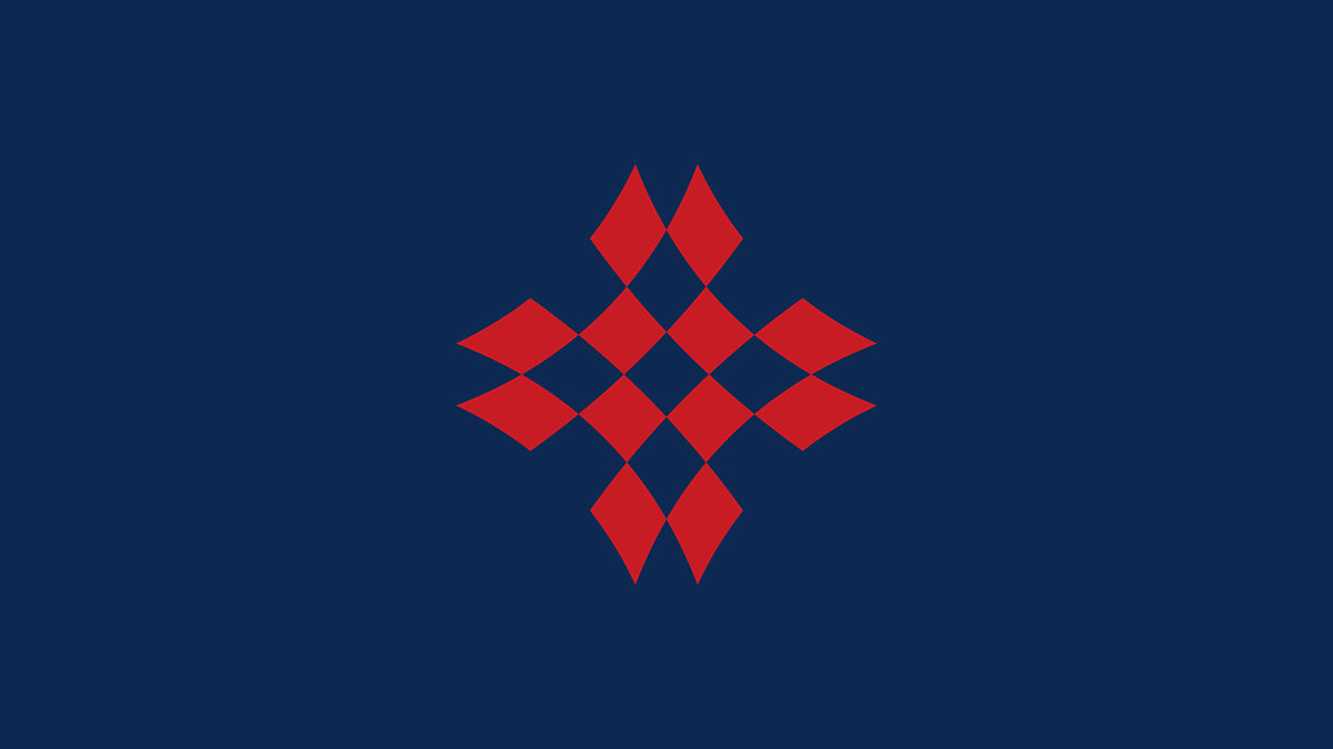
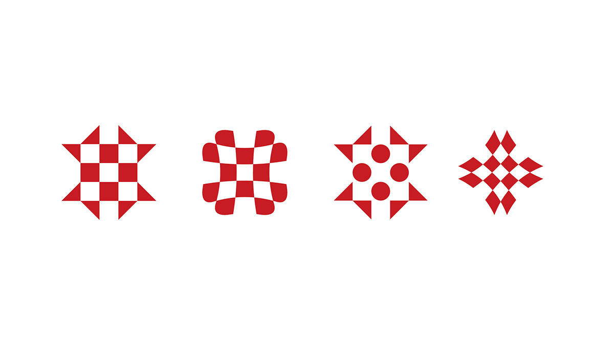
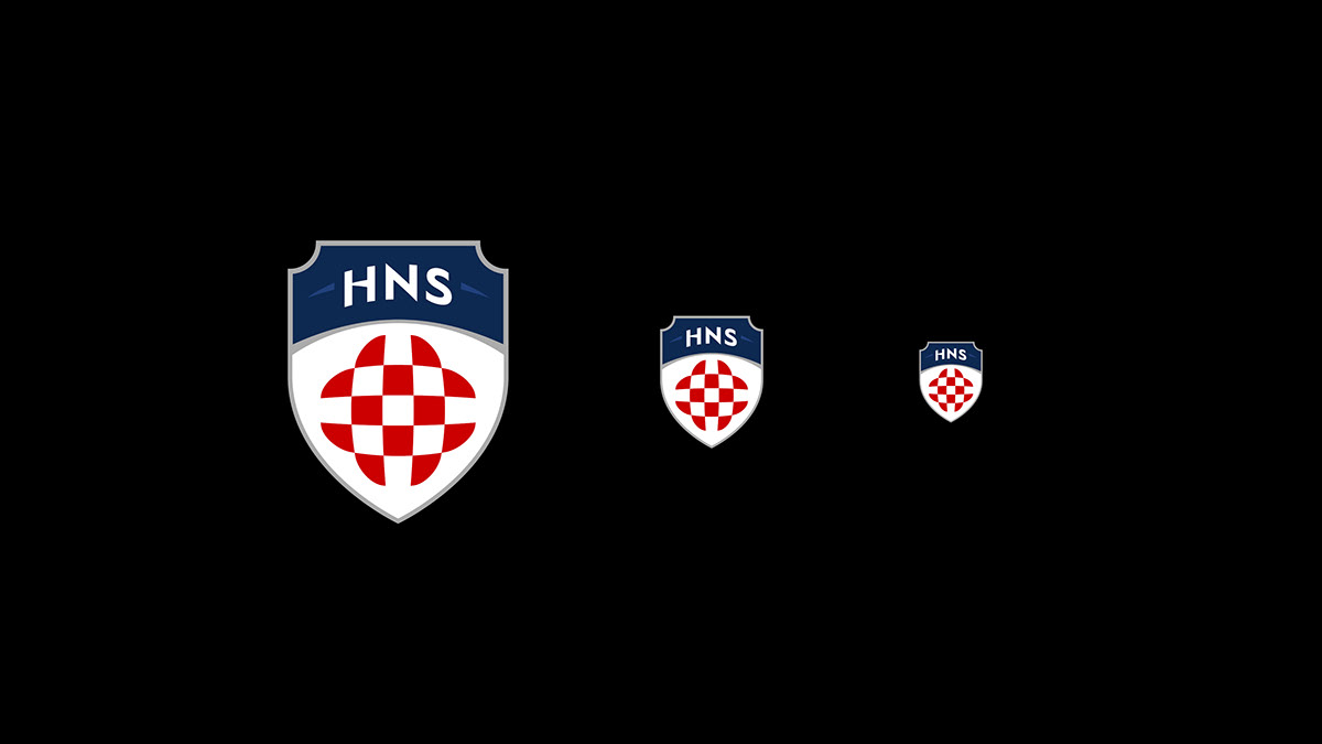
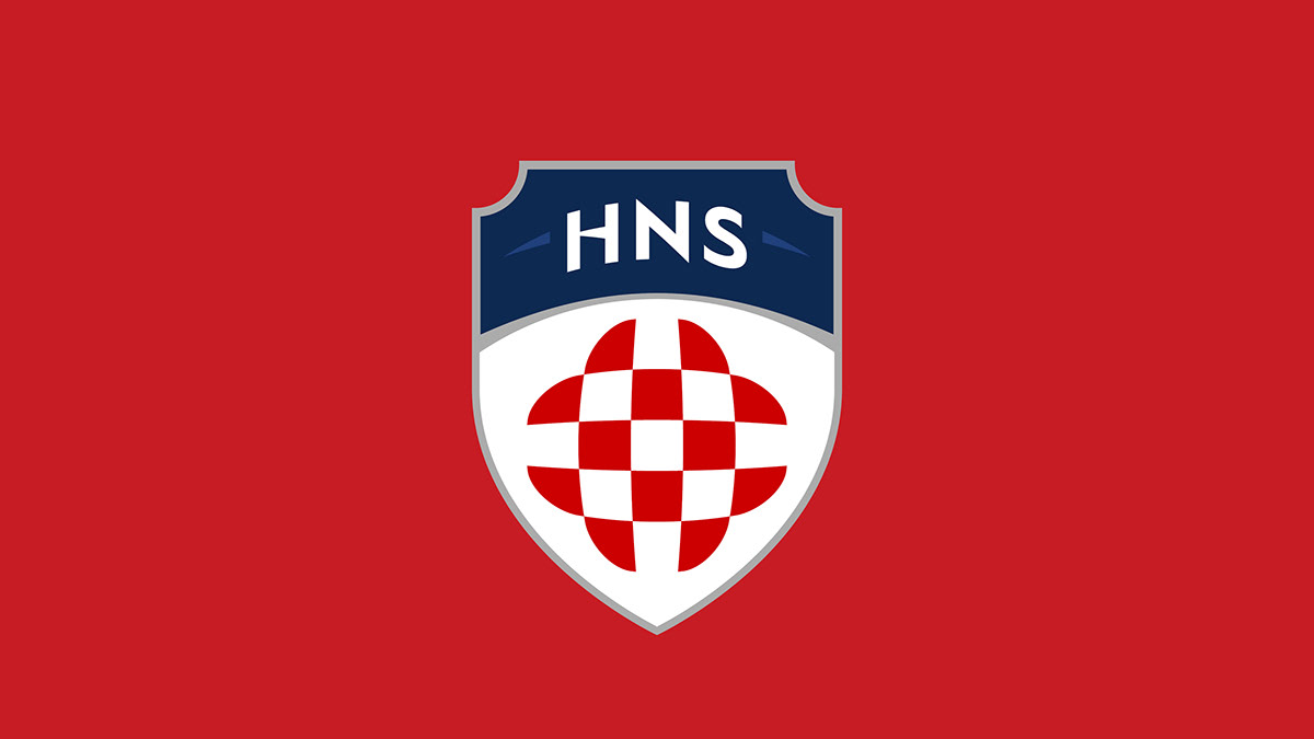
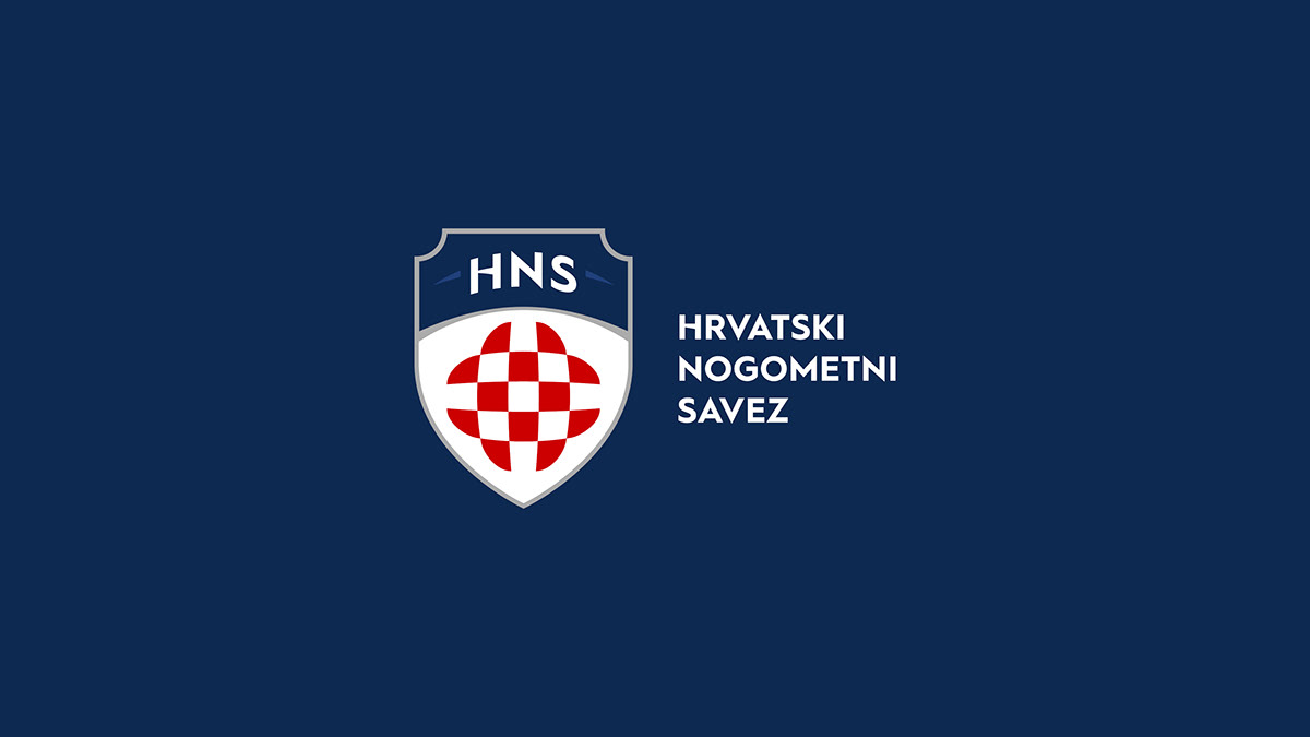
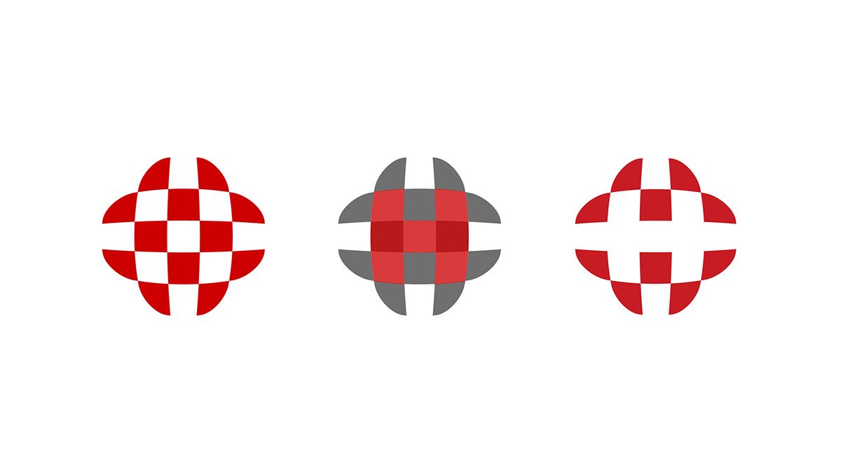
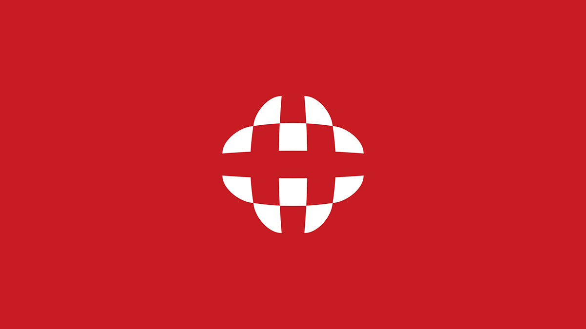
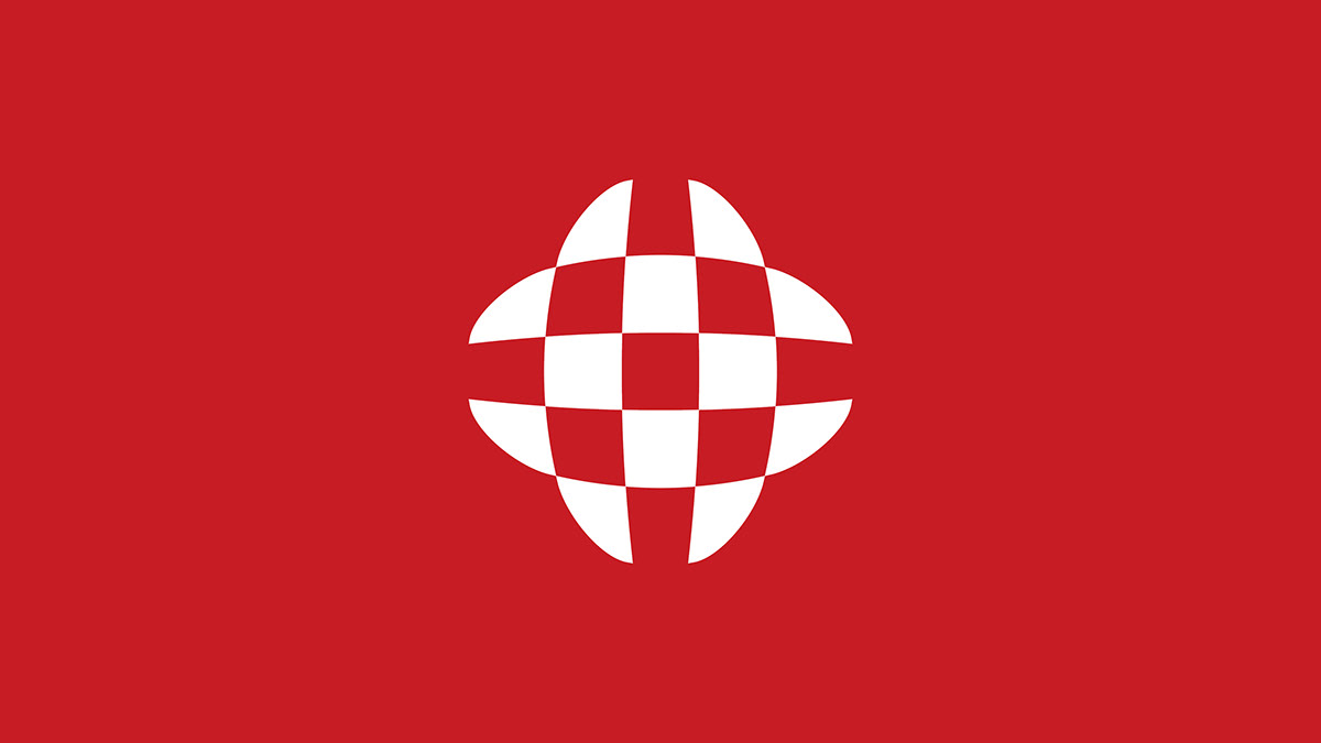
Following their success at the 2018 World Cup, it seemed like the perfect moment for the country to modernize its crest. We submitted a proposal that combined a soccer ball with the iconic checkerboard pattern to form the letter “H”—the team’s initial in the official language.
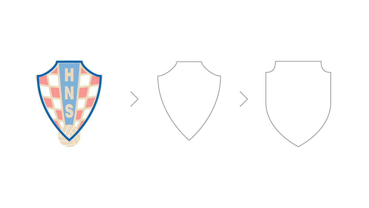
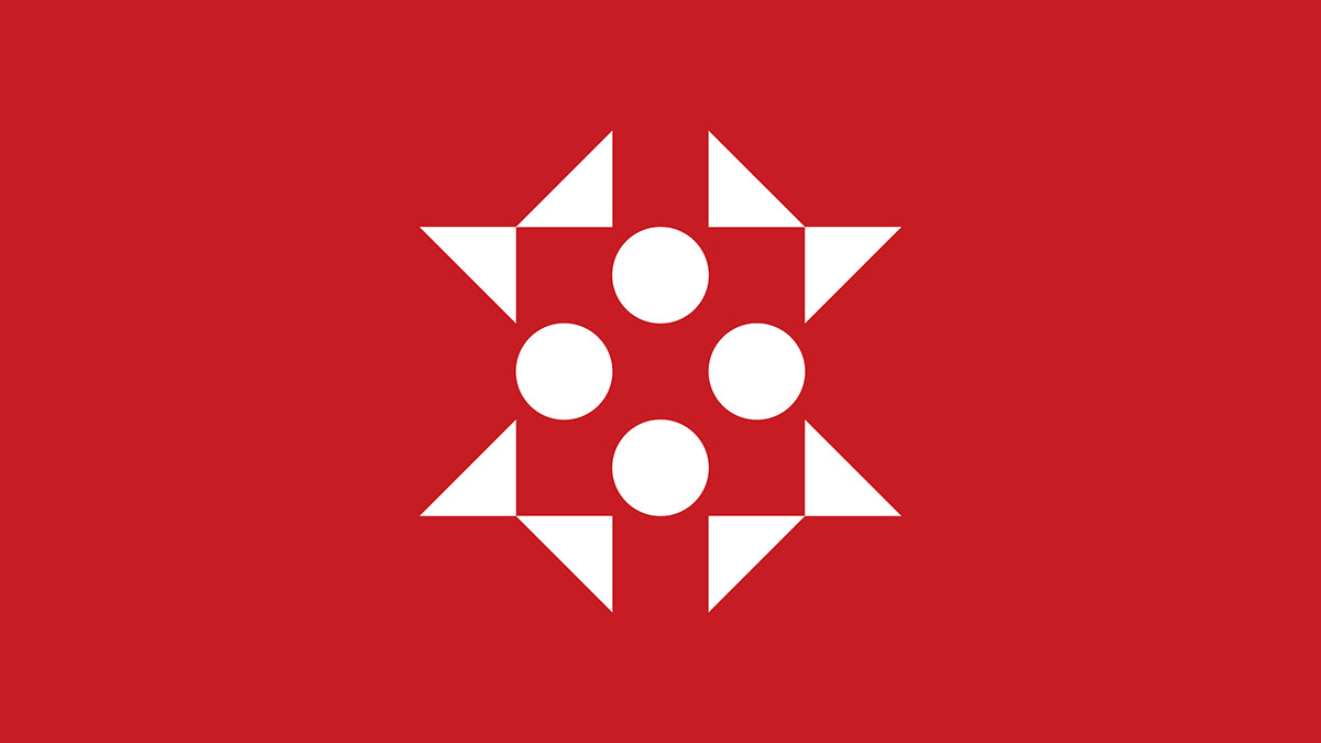
After numerous sketches and tests aimed at creating a unique brand identity, we chose to develop a design that departed from the original silhouette, taking a bold, risky approach to stand out from the other entries.
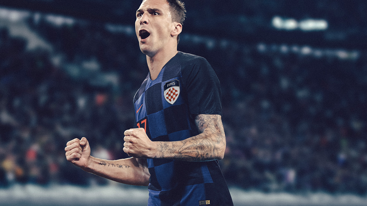
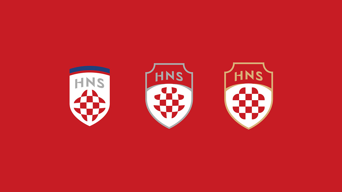
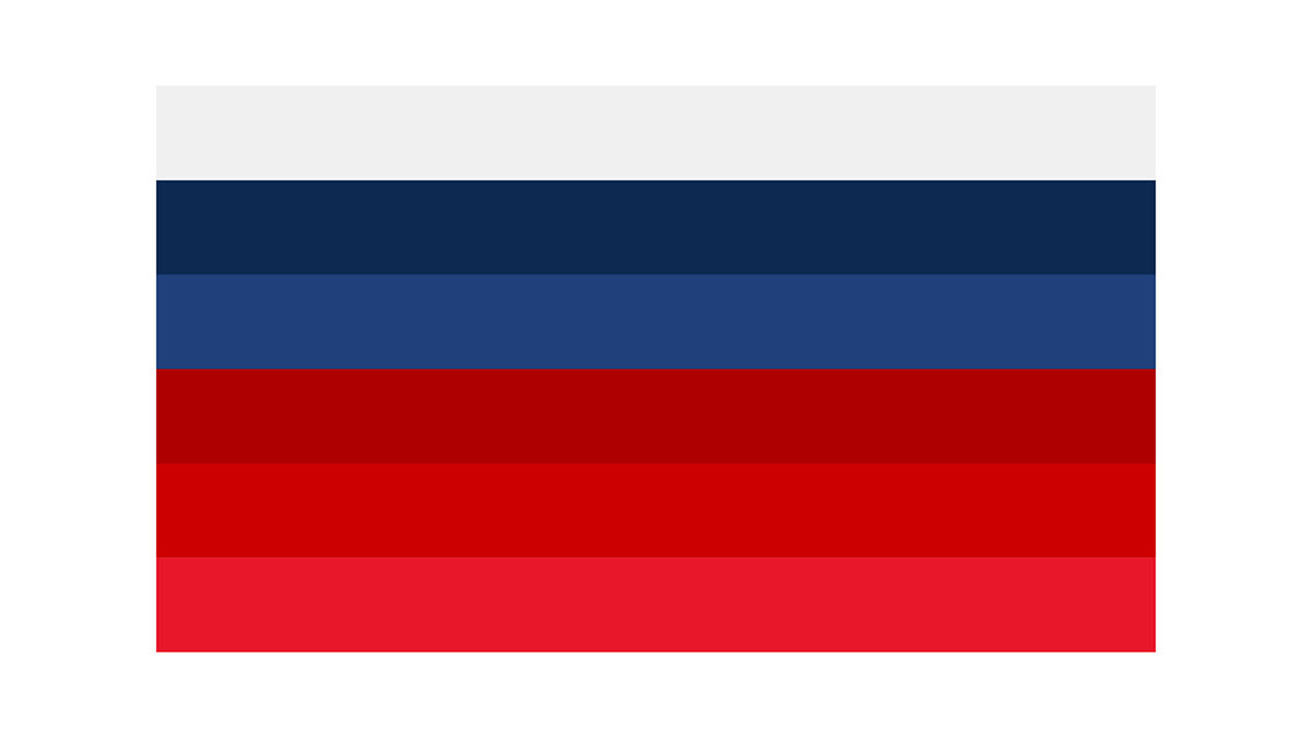
We also suggested to remove the gold color from the old crest and give an opportunity to gray and silver colors on both crest and identity. The reason has nothing to do with the 2018 World Cup. We understand that red and blue are more important on the crest, and silver is a color that combines with them, adding a nice touch of modernity and high-tech to promote a new HNS.
The selection process was never concluded, and the Federation’s branding remained unchanged; however, our designs live on as inspiration for a new generation of designers looking to modernize sports branding.
General Enquiries, Media & PR
NY +1 917 720 3422
UK +44 20 8144 3396
BR +55 11 984550190
Av. Presidente Juscelino Kubitschek, 1455 - 4º andar.
São Paulo, SP
04543 011

let's celebrate life
©2024, MapzFlaggen™ Capital Partners. All rights reserved. The content featured on this page is the responsibility of the authors and does not represent the interests of third parties. Images are only to promote discussion and illustrate concepts and ideas. MapzFlaggen™, Nacione™ and Lanatta™ are a trademark of Mapz-Flaggen Capital Partners.
This site uses cookies to make sure you have a true and respectful experience. Learn more about our Privacy Policy here.

